The first of the Charting Basics series, in this article we’ll be going over candlesticks and periods which they represent.
Candlesticks
Likely, you’ve seen a price chart before and for beginners you’ll often seen a basic line chart. However, when trading you’ll want a more informational approach. In that case, you’ll want to look at a chart that’s using candlesticks and periods which they represent. If you’ve never used candlesticks before they can be a bit daunting to begin with, but once you understand them they can provide a great amount of insight into price movement. In the following image, you’ll see a simplistic example comparing a candlestick chart and a line chart.

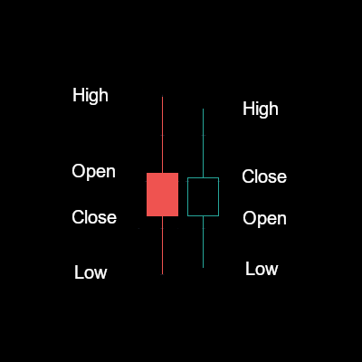
Below you’ll see two examples of a candlestick with each of the points labeled. The primary difference between the two is the direction of the candlestick which denotes the color. The red candlestick closed lower than it opened, indicating a descending direction and the green candlestick did the inverse closing higher than it opened. You may also be wondering what the thin “wicks” are above and below the body of the candlestick. These are also referred to as shadows and indicate the highest/lowest point the candlestick reached in the time period displayed.
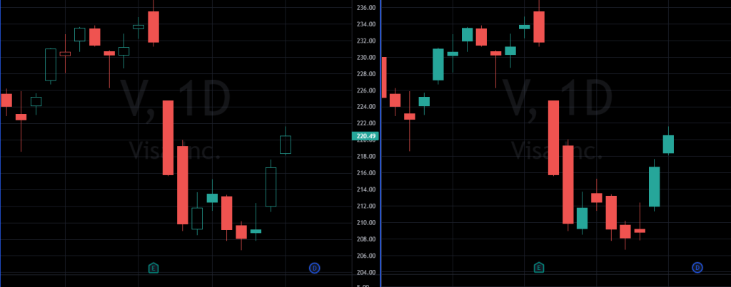
The benefits of using hollow candlesticks allow you to easily identify trends based upon the previous candlestick without potential for a false indicator. In the following example, you’ll see the same timeframe displayed twice. The left shows hollow candles while the right shows filled. In the hollow candles, you can see instances where the price went up from the previous candle, but still closed lower than the open price which results in a filled green candle.
Periods
Periods are the timeframe in which the candlestick represents. At the open of the period, a new candle starts and movement is plotted through the duration of the period until close. This forms the overall shape of the candlestock. The platform you are using usually determines what periods you can use. On TradingView, if you are paying for even the basic plan, you can specify custom periods in whatever interval you prefer. The common periods are 5 min, 15 min, 1 hour, 4 hour, 1 day, 1 week, and 1 month.
Depending on what you are trading usually determines what periods you want to watch. For stocks/options, I like to watch the 15 minute, and the 1 day as a start. The 15 minute period allows you to see when to enter a trade, and the day period indicates a longer trend. It never hurts to take into account the 1 hour and the 4 hour as well which can provide greater insight, but can sometimes add too much information. Remember, for regular trading hours, a day in the stock market is shorter than two 4 hour periods.
That’s it for the basics on candlesticks and periods. Enough information to be dangerous with. Later in the series, we’ll go into more detail on how to use multiple periods and candlesticks to determine trends/patterns in price.
Charting Basics: Candlesticks and Periods
Charting Basics: Moving Averages
Charting Basics: Putting it Together
Charting Basics: Optional Indicators
Shameless plug, if you find this helpful and plan on opening a TradingView account or Tastyworks account, please use my referral links.
TradingView
https://www.tradingview.com/gopro/?share_your_love=bcmiller08
tastyworks
https://start.tastyworks.com/#/login?referralCode=GA3Q7TNZBC